Why a New User Experience?
Why a New User Experience?
We know that managing an organization is not easy, and that’s why we are dedicated to being your partner in helping you manage, engage, and grow your association. We are excited to share our improved, intuitive User Experience and talk a little bit about how it can benefit you and your organization.
Intuitive, to us, means a few things. First, that the User Experience is consistent. So when you go to each module or different areas of the site, it behaves in the same way. Some examples of this would be mass selecting. If I am selecting invoices in one screen, and then selecting events in another, those mass select in the same way. Another example would be that we use consistent terminology throughout the site, as well as consistent icons and consistent colors, so that wherever you are, you know what to expect and how something's going to behave.
Intuitive also means that the User Experience is guided. We want to provide more guided workflows that help you feel confident in how you accomplish day-to-day tasks within the software.
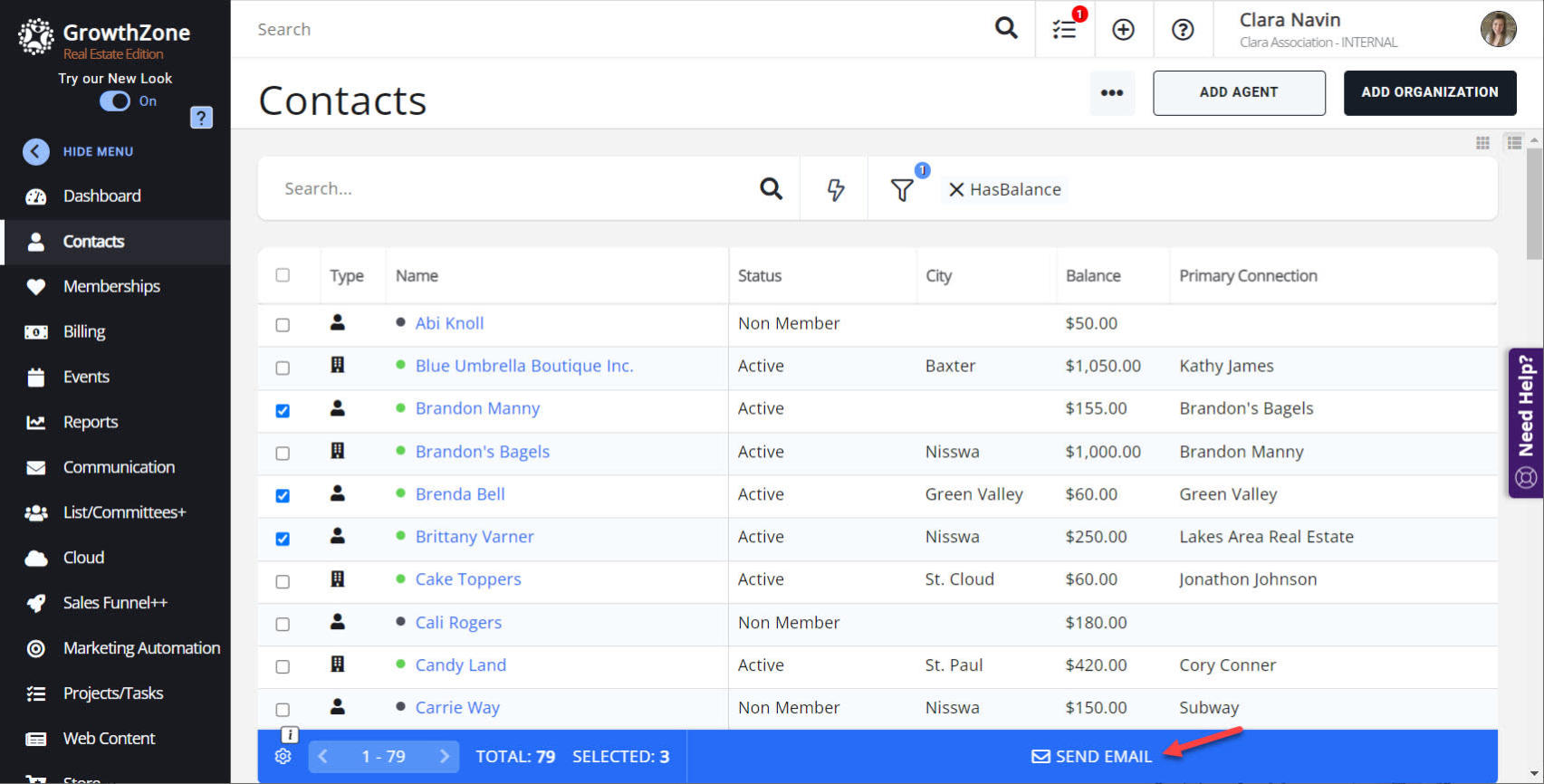
We’ve worked to streamline some of the more common processes. One great example of this is sending a mass email. Within the contacts module, you can quickly and easily filter down to who you’d like, select those that are needed using the new checkboxes, and then send them an email, from one screen. We’ve also added guided walkthroughs that step you through how to accomplish something, right within the software. You can find a number of these walkthroughs by using the purple “Need Help?” tab at the right side of the screen.

Finally, we feel intuitive means meaningful. Our new User Experience gives you quick access to the data you care about, by making it front and center as well as customizable.
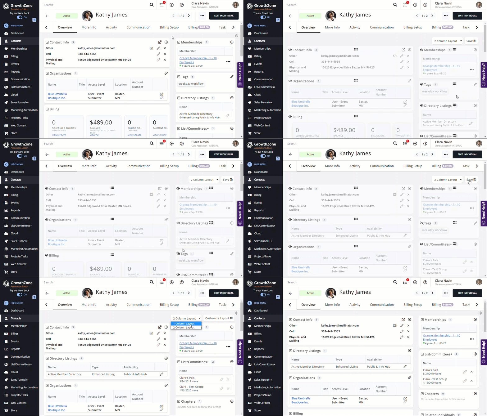
A great example of this is on the Contacts Overview tab. You can easily arrange the sections of information in the order you want them to appear. You even have the ability to hide sections. These customizations are personalized to your user and don’t affect other staff within your database, which helps to ensure each staff member sees the data that is meaningful to them.

Consistent, guided, and meaningful is our definition of intuitive, and that really is the goal we are moving toward. In order for us to build out this new intuitive experience, we needed to alter the look a bit.
We know that an intuitive User Experience can save you time and enhance your overall experience. Navigating a confusing website or software, spending precious time trying to figure out what’s next is not intuitive. With our improved user interface, you can quickly find the tools and features you need to manage your association, reducing the time spent on tasks and freeing you up to focus more on your members and your strategic initiatives.
The new look and functionality that you see today is certainly not done, but it's a big step towards where we're headed. We understand that an improved User Experience is critical to the success of your association, and we are excited to partner with you as you engage and grow with your members.
For more information on our new User Experience, watch this short video highlighting the new look and functionality. You can also experience it yourself, by logging into the GrowthZone software and ensuring the "Try our New Look" toggle is flipped on.